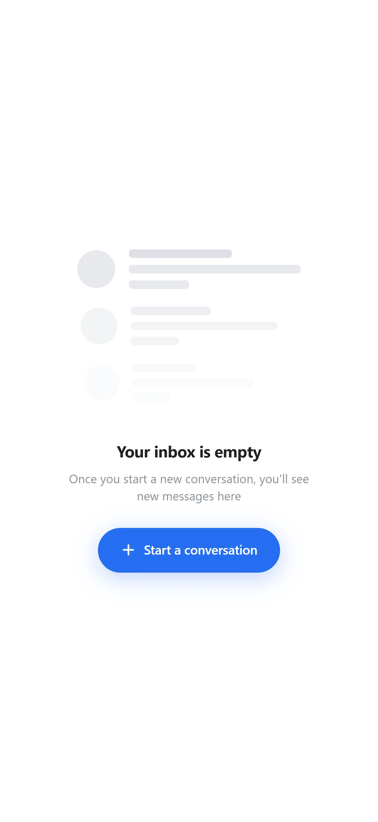

Пустой экран
Пустая почта V1
Что показывает список, почта или галерея, пока в них пусто.
Установка
src/shared/components/blocks/empty-inbox-v1npx astra-rn add empty-inbox-v1pnpm dlx astra-rn add empty-inbox-v1yarn dlx astra-rn add empty-inbox-v1bunx --bun astra-rn add empty-inbox-v1Зависимости
2 пакетаnpm install react-native-reanimated react-native-svgpnpm add react-native-reanimated react-native-svgyarn add react-native-reanimated react-native-svgbun add react-native-reanimated react-native-svgИсходник
3 файлаimport React, { memo, useCallback, useEffect, useState } from "react";
import { Pressable, StyleSheet, Text, View } from "react-native";
import Animated, {
Easing,
useAnimatedStyle,
useSharedValue,
withRepeat,
withTiming,
cancelAnimation,
} from "react-native-reanimated";
import Svg, { Path } from "react-native-svg";
import type { IEmptyInboxState, IGlyph, ISkeletonRow } from "./types";
import {
ACTION_HEIGHT,
ACTION_HORIZONTAL_PADDING,
COLORS,
CONTENT_HORIZONTAL_PADDING,
DEFAULT_ACTION_LABEL,
DEFAULT_DESCRIPTION,
DEFAULT_TITLE,
PULSE_DURATION,
PULSE_MAX_OPACITY,
PULSE_MIN_OPACITY,
SKELETON_CIRCLE_SIZE,
SKELETON_LINE_GAP,
SKELETON_LINE_HEIGHT,
SKELETON_LINE_RADIUS,
SKELETON_ROW_GAP,
SKELETON_ROWS,
} from "./const";
const PlusGlyph: React.FC<IGlyph> = ({
size = 19,
color = COLORS.actionLabel,
}: IGlyph) => (
<Svg width={size} height={size} viewBox="0 0 24 24" fill="none">
<Path
d="M12 5V19M5 12H19"
stroke={color}
strokeWidth={2.4}
strokeLinecap="round"
/>
</Svg>
);
const SkeletonRow: React.FC<ISkeletonRow> = memo(
({ opacity, scale, lineWidths }: ISkeletonRow) => (
<View
style={[styles.skeletonRow, { opacity, transform: [{ scale }] }]}
accessibilityElementsHidden
importantForAccessibility="no-hide-descendants"
>
<View style={styles.skeletonCircle} />
<View>
{lineWidths.map((width, index) => (
<View
key={width}
style={[
styles.skeletonLine,
{ width },
index === 0 ? styles.skeletonLineStrong : null,
index === lineWidths.length - 1 ? styles.skeletonLineLast : null,
]}
/>
))}
</View>
</View>
),
);
SkeletonRow.displayName = "SkeletonRow";
const EmptyInboxState: React.FC<IEmptyInboxState> = ({
title = DEFAULT_TITLE,
description = DEFAULT_DESCRIPTION,
actionLabel = DEFAULT_ACTION_LABEL,
hideAction = false,
animated = true,
style,
onActionPress,
}: IEmptyInboxState) => {
const pulse = useSharedValue<number>(PULSE_MAX_OPACITY);
const [isActionPressed, setIsActionPressed] = useState<boolean>(false);
const handlePressIn = useCallback((): void => setIsActionPressed(true), []);
const handlePressOut = useCallback((): void => setIsActionPressed(false), []);
useEffect(() => {
if (!animated) {
cancelAnimation(pulse);
pulse.value = PULSE_MAX_OPACITY;
return;
}
pulse.value = withRepeat(
withTiming(PULSE_MIN_OPACITY, {
duration: PULSE_DURATION,
easing: Easing.inOut(Easing.quad),
}),
-1,
true,
);
return () => cancelAnimation(pulse);
}, [animated, pulse]);
const pulseStyle = useAnimatedStyle(() => ({ opacity: pulse.value }));
return (
<View style={[styles.container, style]}>
<Animated.View style={[styles.stack, pulseStyle]}>
{SKELETON_ROWS.map((row, index) => (
<SkeletonRow key={`skeleton-${index}`} {...row} />
))}
</Animated.View>
<Text style={styles.title}>{title}</Text>
<Text style={styles.description}>{description}</Text>
{hideAction ? null : (
<Pressable
accessibilityRole="button"
accessibilityLabel={actionLabel}
onPress={onActionPress}
onPressIn={handlePressIn}
onPressOut={handlePressOut}
style={[styles.action, isActionPressed ? styles.actionPressed : null]}
>
<PlusGlyph />
<Text style={styles.actionLabel} numberOfLines={1}>
{actionLabel}
</Text>
</Pressable>
)}
</View>
);
};
const styles = StyleSheet.create({
container: {
flex: 1,
alignItems: "center",
justifyContent: "center",
paddingHorizontal: CONTENT_HORIZONTAL_PADDING,
backgroundColor: COLORS.screen,
},
stack: {
marginBottom: 22,
},
skeletonRow: {
flexDirection: "row",
alignItems: "center",
marginBottom: SKELETON_ROW_GAP,
},
skeletonCircle: {
width: SKELETON_CIRCLE_SIZE,
height: SKELETON_CIRCLE_SIZE,
borderRadius: SKELETON_CIRCLE_SIZE / 2,
backgroundColor: COLORS.skeleton,
marginRight: 16,
},
skeletonLine: {
height: SKELETON_LINE_HEIGHT,
borderRadius: SKELETON_LINE_RADIUS,
backgroundColor: COLORS.skeleton,
marginBottom: SKELETON_LINE_GAP,
},
skeletonLineStrong: {
backgroundColor: COLORS.skeletonStrong,
},
skeletonLineLast: {
marginBottom: 0,
},
title: {
marginTop: 4,
marginBottom: 8,
fontSize: 20,
lineHeight: 26,
fontWeight: "700",
letterSpacing: -0.4,
color: COLORS.title,
textAlign: "center",
},
description: {
maxWidth: 300,
fontSize: 15,
lineHeight: 22,
fontWeight: "500",
color: COLORS.description,
textAlign: "center",
},
action: {
flexDirection: "row",
alignItems: "center",
gap: 8,
marginTop: 26,
height: ACTION_HEIGHT,
paddingHorizontal: ACTION_HORIZONTAL_PADDING,
borderRadius: ACTION_HEIGHT / 2,
backgroundColor: COLORS.accent,
shadowColor: COLORS.accent,
shadowOpacity: 0.3,
shadowRadius: 14,
shadowOffset: { width: 0, height: 6 },
elevation: 6,
},
actionPressed: {
backgroundColor: COLORS.accentPressed,
},
actionLabel: {
fontSize: 16,
fontWeight: "600",
letterSpacing: -0.2,
color: COLORS.actionLabel,
},
});
export { EmptyInboxState };
export type { IEmptyInboxState, IGlyph, ISkeletonRow } from "./types";
export default memo(EmptyInboxState);import type { ISkeletonRow } from "./types";
export const DEFAULT_TITLE = "Your inbox is empty";
export const DEFAULT_DESCRIPTION =
"Once you start a new conversation, you'll see new messages here";
export const DEFAULT_ACTION_LABEL = "Start a conversation";
export const CONTENT_HORIZONTAL_PADDING = 24;
export const SKELETON_CIRCLE_SIZE = 44;
export const SKELETON_LINE_HEIGHT = 10;
export const SKELETON_LINE_RADIUS = 4;
export const SKELETON_LINE_GAP = 8;
export const SKELETON_ROW_GAP = 20;
export const SKELETON_ROWS: ISkeletonRow[] = [
{ opacity: 1, scale: 1, lineWidths: [120, 200, 70] },
{ opacity: 0.55, scale: 0.97, lineWidths: [96, 176, 58] },
{ opacity: 0.24, scale: 0.94, lineWidths: [78, 150, 48] },
];
export const PULSE_MIN_OPACITY = 0.55;
export const PULSE_MAX_OPACITY = 1;
export const PULSE_DURATION = 1100;
export const ACTION_HEIGHT = 52;
export const ACTION_HORIZONTAL_PADDING = 26;
export const COLORS = {
screen: "#ffffff",
title: "#222222",
description: "#8c9197",
skeleton: "#e8e9ed",
skeletonStrong: "#dfe1e7",
accent: "#266ef1",
accentPressed: "#1b57c4",
actionLabel: "#ffffff",
} as const;import type { StyleProp, ViewStyle } from "react-native";
export interface IGlyph {
size?: number;
color?: string;
}
export interface ISkeletonRow {
opacity: number;
scale: number;
lineWidths: readonly number[];
}
export interface IEmptyInboxState {
title?: string;
description?: string;
actionLabel?: string;
hideAction?: boolean;
animated?: boolean;
style?: StyleProp<ViewStyle>;
onActionPress?: () => void;
}