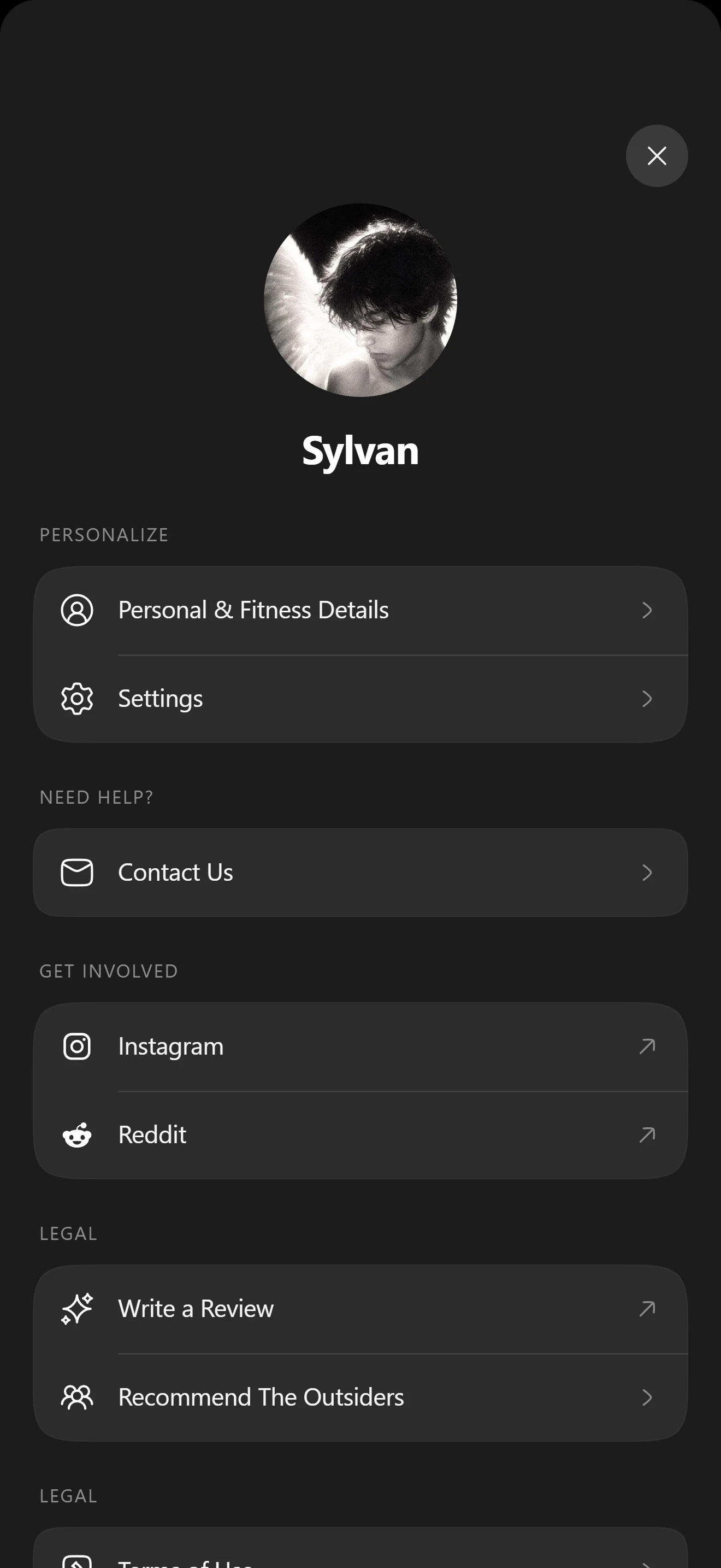

Настройки
Настройки профиля V1
Экраны профиля и настроек из сгруппированных строк.
Установка
src/shared/components/blocks/profile-settings-v1npx astra-rn add profile-settings-v1pnpm dlx astra-rn add profile-settings-v1yarn dlx astra-rn add profile-settings-v1bunx --bun astra-rn add profile-settings-v1Зависимости
7 пакетовnpm install @hugeicons/core-free-icons @hugeicons/react-native @shopify/react-native-skia expo-asset react-native-reanimated react-native-safe-area-context react-native-svgpnpm add @hugeicons/core-free-icons @hugeicons/react-native @shopify/react-native-skia expo-asset react-native-reanimated react-native-safe-area-context react-native-svgyarn add @hugeicons/core-free-icons @hugeicons/react-native @shopify/react-native-skia expo-asset react-native-reanimated react-native-safe-area-context react-native-svgbun add @hugeicons/core-free-icons @hugeicons/react-native @shopify/react-native-skia expo-asset react-native-reanimated react-native-safe-area-context react-native-svgИсходник
4 файлаimport {
ArrowRight01Icon,
ArrowUpRight01Icon,
Cancel01Icon,
} from "@hugeicons/core-free-icons";
import { HugeiconsIcon } from "@hugeicons/react-native";
import React, { memo, useCallback, useState } from "react";
import {
Image,
Pressable,
ScrollView,
StyleSheet,
Text,
View,
} from "react-native";
import Svg, { Path } from "react-native-svg";
import { SquircleView } from "@/shared/components/base/squircle-view";
import {
AVATAR_SIZE,
CLOSE_SIZE,
COLORS,
CONTENT_BOTTOM_PADDING,
CONTENT_HORIZONTAL_PADDING,
CONTENT_TOP_PADDING,
DEFAULT_HEADER,
DEFAULT_SECTIONS,
GROUP_BORDER_WIDTH,
GROUP_CORNER_SMOOTHING,
GROUP_GAP,
GROUP_RADIUS,
ROW_HEIGHT,
ROW_HORIZONTAL_PADDING,
ROW_ICON_GAP,
ROW_ICON_SIZE,
SECTION_GAP,
SEPARATOR_INSET,
SHEET_RADIUS,
} from "./const";
import type { IGlyph, IProfileSettingsV1, ISettingsRowItem } from "./types";
import { useSafeAreaInsets } from "react-native-safe-area-context";
const InstagramGlyph: React.FC<IGlyph> = ({
size = ROW_ICON_SIZE,
color = COLORS.icon,
}: IGlyph) => (
<Svg width={size} height={size} viewBox="0 0 32 32">
<Path
d="M22.3,8.4c-0.8,0-1.4,0.6-1.4,1.4c0,0.8,0.6,1.4,1.4,1.4c0.8,0,1.4-0.6,1.4-1.4C23.7,9,23.1,8.4,22.3,8.4z"
fill={color}
/>
<Path
d="M16,10.2c-3.3,0-5.9,2.7-5.9,5.9s2.7,5.9,5.9,5.9s5.9-2.7,5.9-5.9S19.3,10.2,16,10.2z M16,19.9c-2.1,0-3.8-1.7-3.8-3.8 c0-2.1,1.7-3.8,3.8-3.8c2.1,0,3.8,1.7,3.8,3.8C19.8,18.2,18.1,19.9,16,19.9z"
fill={color}
/>
<Path
d="M20.8,4h-9.5C7.2,4,4,7.2,4,11.2v9.5c0,4,3.2,7.2,7.2,7.2h9.5c4,0,7.2-3.2,7.2-7.2v-9.5C28,7.2,24.8,4,20.8,4z M25.7,20.8 c0,2.7-2.2,5-5,5h-9.5c-2.7,0-5-2.2-5-5v-9.5c0-2.7,2.2-5,5-5h9.5c2.7,0,5,2.2,5,5V20.8z"
fill={color}
/>
</Svg>
);
const RedditGlyph: React.FC<IGlyph> = ({
size = ROW_ICON_SIZE,
color = COLORS.icon,
}: IGlyph) => (
<Svg width={size} height={size} viewBox="0 0 640 640">
<Path
d="M437 202.6C411.8 202.6 390.7 185.1 385.1 161.6C354.5 165.9 330.9 192.3 330.9 224L330.9 224.2C378.3 226 421.5 239.3 455.8 260.5C468.4 250.8 484.2 245 501.3 245C542.6 245 576 278.4 576 319.7C576 349.5 558.6 375.2 533.3 387.2C530.9 474 436.3 543.8 320.1 543.8C203.9 543.8 109.5 474.1 107 387.4C81.6 375.5 64 349.7 64 319.7C64 278.4 97.4 245 138.7 245C155.9 245 171.7 250.8 184.4 260.6C218.4 239.5 261.2 226.2 308.1 224.2L308.1 223.9C308.1 179.6 341.8 143 384.9 138.4C389.8 114.2 411.2 96 437 96C466.4 96 490.3 119.9 490.3 149.3C490.3 178.7 466.4 202.6 437 202.6zM221.5 319.3C200.6 319.3 182.6 340.1 181.3 367.2C180 394.3 198.4 405.3 219.3 405.3C240.2 405.3 255.9 395.5 257.1 368.4C258.3 341.3 242.4 319.3 221.4 319.3L221.5 319.3zM459 367.1C457.8 340 439.8 319.2 418.8 319.2C397.8 319.2 381.9 341.2 383.1 368.3C384.3 395.4 400 405.2 420.9 405.2C441.8 405.2 460.2 394.2 458.9 367.1L459 367.1zM398.9 437.9C400.4 434.3 397.9 430.2 394 429.8C371 427.5 346.1 426.2 320.2 426.2C294.3 426.2 269.4 427.5 246.4 429.8C242.5 430.2 240 434.3 241.5 437.9C254.4 468.7 284.8 490.3 320.2 490.3C355.6 490.3 386 468.7 398.9 437.9z"
fill={color}
/>
</Svg>
);
const SettingsRowItem: React.FC<ISettingsRowItem> = memo(
({
id,
title,
icon,
accessory = "chevron",
isLast,
onPress,
}: ISettingsRowItem) => {
const [isPressed, setIsPressed] = useState<boolean>(false);
const handlePressIn = useCallback((): void => setIsPressed(true), []);
const handlePressOut = useCallback((): void => setIsPressed(false), []);
const handlePress = useCallback((): void => onPress?.(id), [id, onPress]);
return (
<Pressable
accessibilityRole="button"
accessibilityLabel={title}
onPress={handlePress}
onPressIn={handlePressIn}
onPressOut={handlePressOut}
style={[styles.row, isPressed ? styles.rowPressed : null]}
>
<View style={styles.rowIcon}>
{icon?.kind === "instagram" ? <InstagramGlyph /> : null}
{icon?.kind === "reddit" ? <RedditGlyph /> : null}
{icon?.kind === "hugeicon" ? (
<HugeiconsIcon
icon={icon.icon}
size={ROW_ICON_SIZE}
color={COLORS.icon}
/>
) : null}
</View>
<Text style={styles.rowTitle} numberOfLines={1}>
{title}
</Text>
{accessory === "none" ? null : (
<HugeiconsIcon
icon={
accessory === "external" ? ArrowUpRight01Icon : ArrowRight01Icon
}
size={18}
color={COLORS.accessory}
/>
)}
{isLast ? null : <View style={styles.separator} />}
</Pressable>
);
},
);
const ProfileSettingsV1: React.FC<IProfileSettingsV1> = ({
header = DEFAULT_HEADER,
sections = DEFAULT_SECTIONS,
hideClose = false,
style,
onClosePress,
onRowPress,
}: IProfileSettingsV1) => {
const [isClosePressed, setIsClosePressed] = useState<boolean>(false);
const handleClosePressIn = useCallback(
(): void => setIsClosePressed(true),
[],
);
const handleClosePressOut = useCallback(
(): void => setIsClosePressed(false),
[],
);
const insets = useSafeAreaInsets();
return (
<View style={[styles.container, style]}>
<ScrollView
contentContainerStyle={[
styles.content,
{
paddingTop: insets.top + CONTENT_TOP_PADDING,
},
]}
showsVerticalScrollIndicator={false}
>
{hideClose ? null : (
<Pressable
accessibilityRole="button"
accessibilityLabel="Close"
onPress={onClosePress}
onPressIn={handleClosePressIn}
onPressOut={handleClosePressOut}
style={[styles.close, isClosePressed ? styles.closePressed : null]}
>
<HugeiconsIcon
icon={Cancel01Icon}
size={20}
color={COLORS.closeIcon}
/>
</Pressable>
)}
<View style={styles.header}>
{header.avatar ? (
<Image
source={header.avatar}
style={styles.avatar}
resizeMode="cover"
accessibilityIgnoresInvertColors
/>
) : (
<View style={[styles.avatar, styles.avatarPlaceholder]} />
)}
<Text style={styles.name} numberOfLines={1}>
{header.name}
</Text>
</View>
{sections.map((section) => (
<View key={section.id} style={styles.section}>
{section.label ? (
<Text style={styles.label}>{section.label.toUpperCase()}</Text>
) : null}
<SquircleView
cornerRadius={GROUP_RADIUS}
cornerSmoothing={GROUP_CORNER_SMOOTHING}
backgroundColor={COLORS.group}
borderColor={COLORS.groupBorder}
borderWidth={GROUP_BORDER_WIDTH}
>
{section.rows.map((row, index) => (
<SettingsRowItem
key={row.id}
{...row}
isLast={index === section.rows.length - 1}
onPress={onRowPress}
/>
))}
</SquircleView>
</View>
))}
</ScrollView>
</View>
);
};
const styles = StyleSheet.create({
container: {
flex: 1,
borderTopLeftRadius: SHEET_RADIUS,
borderTopRightRadius: SHEET_RADIUS,
overflow: "hidden",
backgroundColor: COLORS.screen,
},
content: {
paddingHorizontal: CONTENT_HORIZONTAL_PADDING,
paddingBottom: CONTENT_BOTTOM_PADDING,
},
close: {
alignSelf: "flex-end",
alignItems: "center",
justifyContent: "center",
width: CLOSE_SIZE,
height: CLOSE_SIZE,
borderRadius: CLOSE_SIZE / 2,
backgroundColor: COLORS.close,
},
closePressed: {
opacity: 0.7,
},
header: {
alignItems: "center",
marginTop: 10,
marginBottom: 30,
},
avatar: {
width: AVATAR_SIZE,
height: AVATAR_SIZE,
borderRadius: AVATAR_SIZE / 2,
},
avatarPlaceholder: {
backgroundColor: COLORS.avatar,
},
name: {
marginTop: 18,
fontSize: 26,
fontWeight: "700",
letterSpacing: -0.4,
color: COLORS.name,
},
section: {
marginBottom: SECTION_GAP,
},
label: {
marginBottom: GROUP_GAP,
marginLeft: 4,
fontSize: 12,
fontWeight: "500",
letterSpacing: 0.9,
color: COLORS.label,
},
row: {
flexDirection: "row",
alignItems: "center",
height: ROW_HEIGHT,
paddingHorizontal: ROW_HORIZONTAL_PADDING,
},
rowPressed: {
backgroundColor: COLORS.rowPressed,
},
rowIcon: {
width: ROW_ICON_SIZE,
height: ROW_ICON_SIZE,
marginRight: ROW_ICON_GAP,
alignItems: "center",
justifyContent: "center",
},
rowTitle: {
flex: 1,
fontSize: 16,
fontWeight: "500",
letterSpacing: -0.2,
color: COLORS.title,
},
separator: {
position: "absolute",
left: SEPARATOR_INSET,
right: 0,
bottom: 0,
height: StyleSheet.hairlineWidth,
backgroundColor: COLORS.separator,
},
});
export { ProfileSettingsV1 };
export type {
IGlyph,
IProfileSettingsV1,
ISettingsHeader,
ISettingsRow,
ISettingsRowItem,
ISettingsSection,
TSettingsRowAccessory,
TSettingsRowIcon,
} from "./types";
export default memo(ProfileSettingsV1);import {
LegalDocument01Icon,
Mail01Icon,
Settings01Icon,
StarsIcon,
UserCircleIcon,
UserGroupIcon,
} from "@hugeicons/core-free-icons";
import type { ISettingsHeader, ISettingsSection } from "./types";
import { PHOTO_SOURCES } from "./photos";
export const DEFAULT_HEADER: ISettingsHeader = {
name: "Sylvan",
avatar: {
uri: PHOTO_SOURCES["profile-settings-v1-1"],
},
};
export const DEFAULT_SECTIONS: ISettingsSection[] = [
{
id: "personalize",
label: "Personalize",
rows: [
{
id: "personal-details",
title: "Personal & Fitness Details",
icon: { kind: "hugeicon", icon: UserCircleIcon },
},
{
id: "settings",
title: "Settings",
icon: { kind: "hugeicon", icon: Settings01Icon },
},
],
},
{
id: "help",
label: "Need Help?",
rows: [
{
id: "contact-us",
title: "Contact Us",
icon: { kind: "hugeicon", icon: Mail01Icon },
},
],
},
{
id: "social",
label: "Get Involved",
rows: [
{
id: "instagram",
title: "Instagram",
icon: { kind: "instagram" },
accessory: "external",
},
{
id: "reddit",
title: "Reddit",
icon: { kind: "reddit" },
accessory: "external",
},
],
},
{
id: "advocacy",
rows: [
{
id: "write-a-review",
title: "Write a Review",
icon: { kind: "hugeicon", icon: StarsIcon },
accessory: "external",
},
{
id: "recommend",
title: "Recommend The Outsiders",
icon: { kind: "hugeicon", icon: UserGroupIcon },
},
],
},
{
id: "legal",
label: "Legal",
rows: [
{
id: "terms-of-use",
title: "Terms of Use",
icon: { kind: "hugeicon", icon: LegalDocument01Icon },
},
],
},
];
export const CONTENT_HORIZONTAL_PADDING = 20;
export const CONTENT_TOP_PADDING = 14;
export const CONTENT_BOTTOM_PADDING = 48;
export const SHEET_RADIUS = 22;
export const CLOSE_SIZE = 38;
export const AVATAR_SIZE = 118;
export const GROUP_RADIUS = 20;
export const GROUP_CORNER_SMOOTHING = 1;
export const GROUP_BORDER_WIDTH = 0.5;
export const ROW_HEIGHT = 54;
export const ROW_HORIZONTAL_PADDING = 16;
export const ROW_ICON_SIZE = 22;
export const ROW_ICON_GAP = 14;
export const SEPARATOR_INSET =
ROW_HORIZONTAL_PADDING + ROW_ICON_SIZE + ROW_ICON_GAP;
export const SECTION_GAP = 26;
export const GROUP_GAP = 12;
export const COLORS = {
screen: "#1c1c1c",
close: "#3a3a3a",
closeIcon: "#f2f2f2",
avatar: "#3a3a3a",
name: "#ffffff",
label: "#8e8e8e",
group: "#2c2c2c",
groupBorder: "rgba(255,255,255,0.04)",
separator: "rgba(255,255,255,0.09)",
rowPressed: "rgba(255,255,255,0.07)",
title: "#f5f5f5",
icon: "#ffffff",
accessory: "#8a8a8a",
} as const;import { IconSvgElement } from "@hugeicons/react-native";
import type { ImageSourcePropType, StyleProp, ViewStyle } from "react-native";
export interface IGlyph {
size?: number;
color?: string;
}
export type TSettingsRowAccessory = "chevron" | "external" | "none";
export type TSettingsRowIcon =
| { kind: "hugeicon"; icon: IconSvgElement }
| { kind: "instagram" }
| { kind: "reddit" };
export interface ISettingsRow {
id: string;
title: string;
icon?: TSettingsRowIcon;
accessory?: TSettingsRowAccessory;
}
export interface ISettingsSection {
id: string;
label?: string;
rows: ISettingsRow[];
}
export interface ISettingsHeader {
name: string;
avatar?: ImageSourcePropType;
}
export interface ISettingsRowItem extends ISettingsRow {
isLast: boolean;
onPress?: (id: string) => void;
}
export interface IProfileSettingsV1 {
header?: ISettingsHeader;
sections?: ISettingsSection[];
hideClose?: boolean;
style?: StyleProp<ViewStyle>;
onClosePress?: () => void;
onRowPress?: (id: string) => void;
}import { Asset } from "expo-asset";
const uri = (id: number): string => Asset.fromModule(id).uri;
export const PHOTO_SOURCES = {
"profile-settings-v1-1": uri(require("./profile-settings-v1-1.webp")),
};Ещё 1 файл с картинками или шрифтами. astra-rn add скачивает их сам, вручную положите их по этим путям:
- src/shared/components/blocks/profile-settings-v1/photos/profile-settings-v1-1.webp111 КБСкачать
