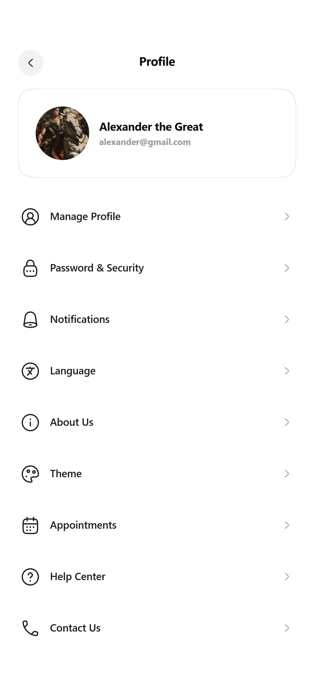

Настройки
Настройки профиля V2
Экраны профиля и настроек из сгруппированных строк.
Установка
src/shared/components/blocks/profile-settings-v2npx astra-rn add profile-settings-v2pnpm dlx astra-rn add profile-settings-v2yarn dlx astra-rn add profile-settings-v2bunx --bun astra-rn add profile-settings-v2Зависимости
6 пакетовnpm install @hugeicons/core-free-icons @hugeicons/react-native @shopify/react-native-skia expo-asset react-native-reanimated react-native-safe-area-contextpnpm add @hugeicons/core-free-icons @hugeicons/react-native @shopify/react-native-skia expo-asset react-native-reanimated react-native-safe-area-contextyarn add @hugeicons/core-free-icons @hugeicons/react-native @shopify/react-native-skia expo-asset react-native-reanimated react-native-safe-area-contextbun add @hugeicons/core-free-icons @hugeicons/react-native @shopify/react-native-skia expo-asset react-native-reanimated react-native-safe-area-contextИсходник
4 файлаimport {
ArrowLeft01Icon,
ArrowRight01Icon,
ArrowUpRight01Icon,
} from "@hugeicons/core-free-icons";
import { HugeiconsIcon } from "@hugeicons/react-native";
import React, { memo, useCallback, useState } from "react";
import {
Image,
Pressable,
ScrollView,
StyleSheet,
Text,
View,
} from "react-native";
import { useSafeAreaInsets } from "react-native-safe-area-context";
import { SquircleView } from "@/shared/components/base/squircle-view";
import {
AVATAR_SIZE,
BACK_SIZE,
CARD_BORDER_WIDTH,
CARD_CORNER_SMOOTHING,
CARD_GAP,
CARD_PADDING,
CARD_RADIUS,
COLORS,
CONTENT_BOTTOM_PADDING,
CONTENT_HORIZONTAL_PADDING,
CONTENT_TOP_PADDING,
DEFAULT_PROFILE,
DEFAULT_SECTIONS,
DEFAULT_TITLE,
FONT_FAMILY,
HEADER_HEIGHT,
LABEL_GAP,
ROW_HEIGHT,
ROW_ICON_GAP,
ROW_ICON_SIZE,
SECTION_GAP,
} from "./const";
import type { IProfileSettingsV2, ISettingsRowItem } from "./types";
const SettingsRowItem: React.FC<ISettingsRowItem> = memo(
({
id,
title,
icon,
value,
accessory = "chevron",
onPress,
}: ISettingsRowItem) => {
const [isPressed, setIsPressed] = useState<boolean>(false);
const handlePressIn = useCallback((): void => setIsPressed(true), []);
const handlePressOut = useCallback((): void => setIsPressed(false), []);
const handlePress = useCallback((): void => onPress?.(id), [id, onPress]);
return (
<Pressable
accessibilityRole="button"
accessibilityLabel={title}
onPress={handlePress}
onPressIn={handlePressIn}
onPressOut={handlePressOut}
style={[styles.row, isPressed ? styles.rowPressed : null]}
>
<View style={styles.rowIcon}>
<HugeiconsIcon icon={icon} size={ROW_ICON_SIZE} color={COLORS.icon} />
</View>
<Text style={styles.rowTitle} numberOfLines={1}>
{title}
</Text>
{value ? (
<Text style={styles.rowValue} numberOfLines={1}>
{value}
</Text>
) : null}
{accessory === "none" ? null : (
<HugeiconsIcon
icon={
accessory === "external" ? ArrowUpRight01Icon : ArrowRight01Icon
}
size={18}
color={COLORS.accessory}
/>
)}
</Pressable>
);
},
);
const ProfileSettingsV2: React.FC<IProfileSettingsV2> = ({
title = DEFAULT_TITLE,
profile = DEFAULT_PROFILE,
sections = DEFAULT_SECTIONS,
hideBack = false,
style,
onBackPress,
onProfilePress,
onRowPress,
}: IProfileSettingsV2) => {
const [isBackPressed, setIsBackPressed] = useState<boolean>(false);
const [isCardPressed, setIsCardPressed] = useState<boolean>(false);
const handleBackPressIn = useCallback((): void => setIsBackPressed(true), []);
const handleBackPressOut = useCallback(
(): void => setIsBackPressed(false),
[],
);
const handleCardPressIn = useCallback((): void => setIsCardPressed(true), []);
const handleCardPressOut = useCallback(
(): void => setIsCardPressed(false),
[],
);
const insets = useSafeAreaInsets();
return (
<View style={[styles.container, style]}>
<View style={[styles.header, { paddingTop: insets.top }]}>
{hideBack ? (
<View style={styles.backSpacer} />
) : (
<Pressable
accessibilityRole="button"
accessibilityLabel="Go back"
onPress={onBackPress}
onPressIn={handleBackPressIn}
onPressOut={handleBackPressOut}
style={[styles.back, isBackPressed ? styles.backPressed : null]}
>
<HugeiconsIcon
icon={ArrowLeft01Icon}
size={20}
color={COLORS.backIcon}
/>
</Pressable>
)}
<Text style={styles.title} numberOfLines={1}>
{title}
</Text>
<View style={styles.backSpacer} />
</View>
<ScrollView
contentContainerStyle={styles.content}
showsVerticalScrollIndicator={false}
>
<Pressable
accessibilityRole="button"
accessibilityLabel={profile.name}
onPress={onProfilePress}
onPressIn={handleCardPressIn}
onPressOut={handleCardPressOut}
>
<SquircleView
cornerRadius={CARD_RADIUS}
cornerSmoothing={CARD_CORNER_SMOOTHING}
backgroundColor={isCardPressed ? COLORS.cardPressed : COLORS.card}
borderColor={COLORS.cardBorder}
borderWidth={CARD_BORDER_WIDTH}
>
<View style={styles.card}>
{profile.avatar ? (
<Image
source={profile.avatar}
style={styles.avatar}
resizeMode="cover"
accessibilityIgnoresInvertColors
/>
) : (
<View style={[styles.avatar, styles.avatarPlaceholder]} />
)}
<View style={styles.cardText}>
<Text style={styles.name} numberOfLines={1}>
{profile.name}
</Text>
{profile.email ? (
<Text style={styles.email} numberOfLines={1}>
{profile.email}
</Text>
) : null}
</View>
</View>
</SquircleView>
</Pressable>
{sections.map((section) => (
<View key={section.id} style={styles.section}>
{section.label ? (
<Text style={styles.label}>{section.label.toUpperCase()}</Text>
) : null}
{section.rows.map((row, index) => (
<SettingsRowItem
key={row.id}
{...row}
isLast={index === section.rows.length - 1}
onPress={onRowPress}
/>
))}
</View>
))}
</ScrollView>
</View>
);
};
const styles = StyleSheet.create({
container: {
flex: 1,
backgroundColor: COLORS.screen,
},
header: {
flexDirection: "row",
alignItems: "center",
paddingHorizontal: CONTENT_HORIZONTAL_PADDING,
},
back: {
alignItems: "center",
justifyContent: "center",
width: BACK_SIZE,
height: BACK_SIZE,
borderRadius: BACK_SIZE / 2,
backgroundColor: COLORS.back,
},
backPressed: {
opacity: 0.7,
},
backSpacer: {
width: BACK_SIZE,
height: BACK_SIZE,
},
title: {
flex: 1,
height: HEADER_HEIGHT,
lineHeight: HEADER_HEIGHT,
textAlign: "center",
fontFamily: FONT_FAMILY,
fontSize: 18,
fontWeight: "700",
letterSpacing: -0.3,
color: COLORS.title,
},
content: {
paddingHorizontal: CONTENT_HORIZONTAL_PADDING,
paddingTop: CONTENT_TOP_PADDING,
paddingBottom: CONTENT_BOTTOM_PADDING,
},
card: {
flexDirection: "row",
alignItems: "center",
width: "100%",
padding: CARD_PADDING,
},
avatar: {
width: AVATAR_SIZE,
height: AVATAR_SIZE,
borderRadius: AVATAR_SIZE / 2,
},
avatarPlaceholder: {
backgroundColor: COLORS.avatar,
},
cardText: {
flex: 1,
minWidth: 0,
marginLeft: CARD_GAP,
},
name: {
fontFamily: FONT_FAMILY,
fontSize: 17,
fontWeight: "700",
letterSpacing: -0.3,
color: COLORS.name,
},
email: {
marginTop: 4,
fontFamily: FONT_FAMILY,
fontSize: 13,
fontWeight: "700",
color: COLORS.email,
},
section: {
marginTop: 22,
},
label: {
marginBottom: LABEL_GAP,
marginLeft: 4,
fontFamily: FONT_FAMILY,
fontSize: 12,
fontWeight: "700",
letterSpacing: 0.9,
color: COLORS.label,
},
row: {
flexDirection: "row",
alignItems: "center",
height: ROW_HEIGHT,
marginBottom: SECTION_GAP,
paddingHorizontal: 4,
borderRadius: 12,
},
rowPressed: {
backgroundColor: COLORS.rowPressed,
},
rowIcon: {
width: ROW_ICON_SIZE,
height: ROW_ICON_SIZE,
marginRight: ROW_ICON_GAP,
alignItems: "center",
justifyContent: "center",
},
rowTitle: {
flex: 1,
fontFamily: FONT_FAMILY,
fontSize: 15.5,
fontWeight: "600",
letterSpacing: -0.1,
color: COLORS.rowTitle,
},
rowValue: {
marginRight: 8,
fontFamily: FONT_FAMILY,
fontSize: 14,
fontWeight: "700",
color: COLORS.value,
},
});
export { ProfileSettingsV2 };
export type {
IGlyph,
IProfileSettingsV2,
ISettingsProfile,
ISettingsRow,
ISettingsRowItem,
ISettingsSection,
TSettingsRowAccessory,
} from "./types";
export default memo(ProfileSettingsV2);import {
Calendar03Icon,
CallIcon,
HelpCircleIcon,
InformationCircleIcon,
LanguageCircleIcon,
LockPasswordIcon,
Notification03Icon,
PaintBoardIcon,
UserCircleIcon,
} from "@hugeicons/core-free-icons";
import { Platform } from "react-native";
import type { ISettingsProfile, ISettingsSection } from "./types";
import { PHOTO_SOURCES } from "./photos";
export const FONT_FAMILY = Platform.select({
ios: "SF Pro Rounded",
default: undefined,
});
export const DEFAULT_TITLE = "Profile";
export const DEFAULT_PROFILE: ISettingsProfile = {
name: "Alexander the Great",
email: "alexander@gmail.com",
avatar: {
uri: PHOTO_SOURCES["profile-settings-v2-1"],
},
};
export const DEFAULT_SECTIONS: ISettingsSection[] = [
{
id: "account",
rows: [
{
id: "manage-profile",
title: "Manage Profile",
icon: UserCircleIcon,
},
{
id: "password-security",
title: "Password & Security",
icon: LockPasswordIcon,
},
{
id: "notifications",
title: "Notifications",
icon: Notification03Icon,
},
{
id: "language",
title: "Language",
icon: LanguageCircleIcon,
},
{
id: "about-us",
title: "About Us",
icon: InformationCircleIcon,
},
{
id: "theme",
title: "Theme",
icon: PaintBoardIcon,
},
{
id: "appointments",
title: "Appointments",
icon: Calendar03Icon,
},
{
id: "help-center",
title: "Help Center",
icon: HelpCircleIcon,
},
{
id: "contact-us",
title: "Contact Us",
icon: CallIcon,
},
],
},
];
export const CONTENT_HORIZONTAL_PADDING = 25;
export const CONTENT_TOP_PADDING = 10;
export const CONTENT_BOTTOM_PADDING = 48;
export const HEADER_HEIGHT = 52;
export const BACK_SIZE = 36;
export const CARD_RADIUS = 20;
export const CARD_CORNER_SMOOTHING = 2;
export const CARD_BORDER_WIDTH = 0.7;
export const CARD_PADDING = 25;
export const CARD_GAP = 14;
export const AVATAR_SIZE = 75;
export const ROW_HEIGHT = 64;
export const ROW_ICON_SIZE = 27;
export const ROW_ICON_GAP = 14;
export const SECTION_GAP = 8;
export const LABEL_GAP = 10;
export const COLORS = {
screen: "#ffffff",
title: "#111111",
back: "#f2f2f2",
backIcon: "#111111",
card: "#ffffff",
cardBorder: "rgba(0,0,0,0.08)",
cardPressed: "#f7f7f7",
avatar: "#ebebeb",
name: "#111111",
email: "#9a9a9a",
label: "#9a9a9a",
rowPressed: "#f5f5f5",
rowTitle: "#1b1b1b",
icon: "#1b1b1b",
value: "#9a9a9a",
accessory: "#9a9a9a",
} as const;import { IconSvgElement } from "@hugeicons/react-native";
import type { ImageSourcePropType, StyleProp, ViewStyle } from "react-native";
export interface IGlyph {
size?: number;
color?: string;
}
export type TSettingsRowAccessory = "chevron" | "external" | "none";
export interface ISettingsRow {
id: string;
title: string;
icon: IconSvgElement;
value?: string;
accessory?: TSettingsRowAccessory;
}
export interface ISettingsSection {
id: string;
label?: string;
rows: ISettingsRow[];
}
export interface ISettingsProfile {
name: string;
email?: string;
avatar?: ImageSourcePropType;
}
export interface ISettingsRowItem extends ISettingsRow {
isLast: boolean;
onPress?: (id: string) => void;
}
export interface IProfileSettingsV2 {
title?: string;
profile?: ISettingsProfile;
sections?: ISettingsSection[];
hideBack?: boolean;
style?: StyleProp<ViewStyle>;
onBackPress?: () => void;
onProfilePress?: () => void;
onRowPress?: (id: string) => void;
}import { Asset } from "expo-asset";
const uri = (id: number): string => Asset.fromModule(id).uri;
export const PHOTO_SOURCES = {
"profile-settings-v2-1": uri(require("./profile-settings-v2-1.webp")),
};Ещё 1 файл с картинками или шрифтами. astra-rn add скачивает их сам, вручную положите их по этим путям:
- src/shared/components/blocks/profile-settings-v2/photos/profile-settings-v2-1.webp85 КБСкачать
