
Приветствие
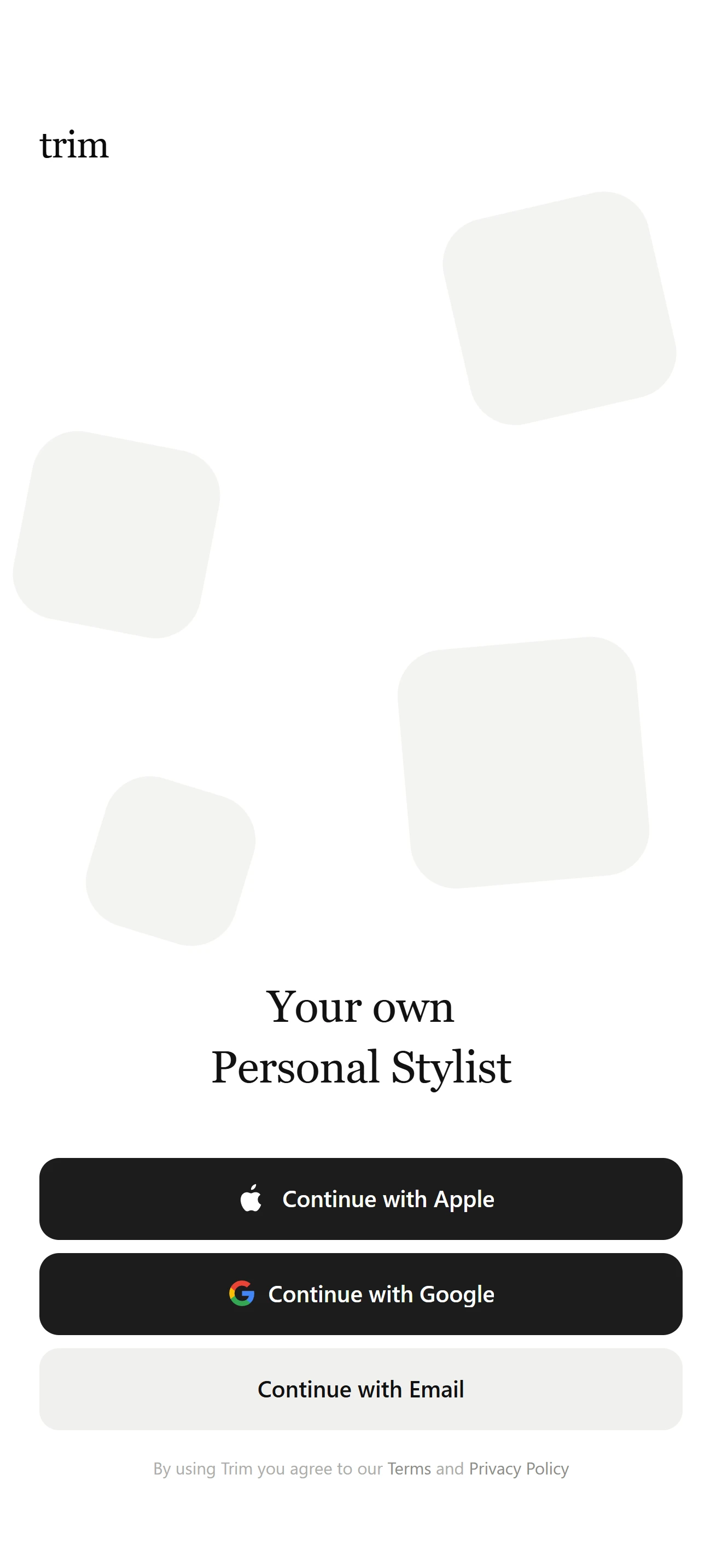
Приветствие V3
Первый запуск и онбординг — стартовый кадр приложения.
Установка
src/shared/components/blocks/welcome-v3npx astra-rn add welcome-v3pnpm dlx astra-rn add welcome-v3yarn dlx astra-rn add welcome-v3bunx --bun astra-rn add welcome-v3Зависимости
2 пакетаnpm install react-native-safe-area-context react-native-svgpnpm add react-native-safe-area-context react-native-svgyarn add react-native-safe-area-context react-native-svgbun add react-native-safe-area-context react-native-svgИсходник
3 файлаimport React, { memo, useCallback, useState } from "react";
import {
Pressable,
StyleSheet,
Text,
View,
useWindowDimensions,
} from "react-native";
import { useSafeAreaInsets } from "react-native-safe-area-context";
import Svg, { Path } from "react-native-svg";
import {
ACTION_GAP,
ACTION_HEIGHT,
ACTION_RADIUS,
CARDS,
CARD_RADIUS,
COLORS,
CONTENT_HORIZONTAL_PADDING,
DEFAULT_ACTIONS,
DEFAULT_LEGAL_PREFIX,
DEFAULT_LEGAL_SEPARATOR,
DEFAULT_PRIVACY_LABEL,
DEFAULT_TERMS_LABEL,
DEFAULT_TITLE_LINES,
DEFAULT_WORDMARK,
ICON_SIZE,
SERIF_FONT,
WORDMARK_SIZE,
} from "./const";
import type {
IGlyph,
IWelcomeAction,
IWelcomeActionRow,
IWelcomeScreenV3,
} from "./types";
const AppleGlyph: React.FC<IGlyph> = ({
size = ICON_SIZE,
color = COLORS.primaryLabel,
}: IGlyph) => (
<Svg width={size * 1.5} height={size * 1.5} viewBox="0 0 24 24" fill="none">
<Path
d="M17.02 12.54c.02 2.19 1.92 2.92 1.94 2.93-.02.05-.3 1.04-1 2.06-.6.88-1.23 1.76-2.22 1.78-.97.02-1.28-.58-2.39-.58s-1.45.56-2.37.6c-.95.03-1.68-.95-2.28-1.83-1.25-1.8-2.2-5.08-.92-7.3.63-1.1 1.76-1.8 2.99-1.81.93-.02 1.82.63 2.39.63.57 0 1.64-.78 2.77-.67.47.02 1.8.19 2.65 1.44-.07.04-1.58.92-1.56 2.75M15.31 6.02c.5-.61.84-1.46.75-2.31-.73.03-1.61.49-2.13 1.1-.47.54-.88 1.4-.77 2.23.81.06 1.64-.41 2.15-1.02"
fill={color}
/>
</Svg>
);
const GoogleGlyph: React.FC<IGlyph> = ({ size = ICON_SIZE }: IGlyph) => (
<Svg width={size} height={size} viewBox="0 0 48 48">
<Path
fill="#4285F4"
d="M45.12 24.5c0-1.56-.14-3.06-.4-4.5H24v8.51h11.84c-.51 2.75-2.06 5.08-4.39 6.64v5.52h7.11c4.16-3.83 6.56-9.47 6.56-16.17z"
/>
<Path
fill="#34A853"
d="M24 46c5.94 0 10.92-1.97 14.56-5.33l-7.11-5.52c-1.97 1.32-4.49 2.1-7.45 2.1-5.73 0-10.58-3.87-12.31-9.07H4.34v5.7C7.96 41.07 15.4 46 24 46z"
/>
<Path
fill="#FBBC05"
d="M11.69 28.18c-.44-1.32-.69-2.73-.69-4.18s.25-2.86.69-4.18v-5.7H4.34A21.99 21.99 0 0 0 2 24c0 3.55.85 6.91 2.34 9.88l7.35-5.7z"
/>
<Path
fill="#EA4335"
d="M24 10.75c3.23 0 6.13 1.11 8.41 3.29l6.31-6.31C34.91 4.18 29.93 2 24 2 15.4 2 7.96 6.93 4.34 14.12l7.35 5.7c1.73-5.2 6.58-9.07 12.31-9.07z"
/>
</Svg>
);
const ICONS: Record<NonNullable<IWelcomeAction["icon"]>, React.FC<IGlyph>> = {
apple: AppleGlyph,
google: GoogleGlyph,
};
const Backdrop: React.FC = memo(() => {
const { width, height } = useWindowDimensions();
return (
<View pointerEvents="none" style={StyleSheet.absoluteFill}>
{CARDS.map((card) => (
<View
key={card.key}
style={[
styles.card,
{
width: card.size,
height: card.size,
top: height * card.top,
left: width * card.left,
transform: [{ rotate: `${card.rotate}deg` }],
},
]}
/>
))}
</View>
);
});
Backdrop.displayName = "Backdrop";
const ActionRow: React.FC<IWelcomeActionRow> = memo(
({ action, onPress }: IWelcomeActionRow) => {
const [pressed, setPressed] = useState<boolean>(false);
const primary = action.variant !== "secondary";
const Icon = action.icon ? ICONS[action.icon] : null;
const handlePress = useCallback(() => onPress?.(action), [action, onPress]);
const handlePressIn = useCallback(() => setPressed(true), []);
const handlePressOut = useCallback(() => setPressed(false), []);
return (
<Pressable
accessibilityRole="button"
accessibilityLabel={action.label}
onPress={handlePress}
onPressIn={handlePressIn}
onPressOut={handlePressOut}
style={[
styles.action,
primary ? styles.actionPrimary : styles.actionSecondary,
pressed
? primary
? styles.actionPrimaryPressed
: styles.actionSecondaryPressed
: null,
]}
>
{Icon ? <Icon size={ICON_SIZE} /> : null}
<Text
style={[
styles.actionLabel,
primary ? styles.actionLabelPrimary : styles.actionLabelSecondary,
]}
numberOfLines={1}
>
{action.label}
</Text>
</Pressable>
);
},
);
const WelcomeScreenV3: React.FC<IWelcomeScreenV3> = ({
wordmark = DEFAULT_WORDMARK,
titleLines = DEFAULT_TITLE_LINES,
actions = DEFAULT_ACTIONS,
legalPrefix = DEFAULT_LEGAL_PREFIX,
termsLabel = DEFAULT_TERMS_LABEL,
legalSeparator = DEFAULT_LEGAL_SEPARATOR,
privacyLabel = DEFAULT_PRIVACY_LABEL,
logo,
style,
onActionPress,
onTermsPress,
onPrivacyPress,
}: IWelcomeScreenV3) => {
const insets = useSafeAreaInsets();
return (
<View style={[styles.container, style]}>
<Backdrop />
<View style={[styles.header, { paddingTop: insets.top + 12 }]}>
{logo ?? <Text style={styles.wordmark}>{wordmark}</Text>}
</View>
<View style={[styles.content, { paddingBottom: insets.bottom + 20 }]}>
<View style={styles.titleBlock}>
{titleLines.map((line) => (
<Text key={line} style={styles.title}>
{line}
</Text>
))}
</View>
<View style={styles.actions}>
{actions.map((action) => (
<ActionRow
key={action.key}
action={action}
onPress={onActionPress}
/>
))}
</View>
<Text style={styles.legal}>
{legalPrefix}{" "}
<Text
accessibilityRole="link"
onPress={onTermsPress}
style={styles.legalLink}
>
{termsLabel}
</Text>{" "}
{legalSeparator}{" "}
<Text
accessibilityRole="link"
onPress={onPrivacyPress}
style={styles.legalLink}
>
{privacyLabel}
</Text>
</Text>
</View>
</View>
);
};
const styles = StyleSheet.create({
container: {
flex: 1,
backgroundColor: COLORS.screen,
},
card: {
position: "absolute",
borderRadius: CARD_RADIUS,
backgroundColor: COLORS.card,
},
header: {
paddingHorizontal: CONTENT_HORIZONTAL_PADDING,
},
wordmark: {
fontFamily: SERIF_FONT,
fontSize: WORDMARK_SIZE,
lineHeight: WORDMARK_SIZE * 1.25,
letterSpacing: -0.3,
color: COLORS.wordmark,
},
content: {
flex: 1,
justifyContent: "flex-end",
paddingHorizontal: CONTENT_HORIZONTAL_PADDING,
},
titleBlock: {
alignItems: "center",
marginBottom: 36,
},
title: {
fontFamily: SERIF_FONT,
fontSize: 29,
lineHeight: 39,
letterSpacing: -0.2,
textAlign: "center",
color: COLORS.title,
},
actions: {
gap: ACTION_GAP,
},
action: {
flexDirection: "row",
alignItems: "center",
justifyContent: "center",
gap: 8,
height: ACTION_HEIGHT,
paddingHorizontal: 18,
borderRadius: ACTION_RADIUS,
},
actionPrimary: {
backgroundColor: COLORS.primary,
},
actionPrimaryPressed: {
backgroundColor: COLORS.primaryPressed,
},
actionSecondary: {
backgroundColor: COLORS.secondary,
},
actionSecondaryPressed: {
backgroundColor: COLORS.secondaryPressed,
},
actionLabel: {
fontSize: 15,
fontWeight: "600",
letterSpacing: -0.1,
},
actionLabelPrimary: {
color: COLORS.primaryLabel,
},
actionLabelSecondary: {
color: COLORS.secondaryLabel,
},
legal: {
marginTop: 16,
fontSize: 11,
lineHeight: 15,
textAlign: "center",
color: COLORS.legal,
},
legalLink: {
color: COLORS.legalLink,
},
});
export { WelcomeScreenV3 };
export type {
IGlyph,
IWelcomeAction,
IWelcomeActionRow,
IWelcomeCard,
IWelcomeScreenV3,
} from "./types";
export default memo(WelcomeScreenV3);import { Platform } from "react-native";
import type { IWelcomeAction, IWelcomeCard } from "./types";
export const DEFAULT_WORDMARK = "trim";
export const DEFAULT_TITLE_LINES = ["Your own", "Personal Stylist"];
export const DEFAULT_ACTIONS: IWelcomeAction[] = [
{
key: "apple",
label: "Continue with Apple",
icon: "apple",
variant: "primary",
},
{
key: "google",
label: "Continue with Google",
icon: "google",
variant: "primary",
},
{
key: "email",
label: "Continue with Email",
variant: "secondary",
},
];
export const DEFAULT_LEGAL_PREFIX = "By using Trim you agree to our";
export const DEFAULT_TERMS_LABEL = "Terms";
export const DEFAULT_LEGAL_SEPARATOR = "and";
export const DEFAULT_PRIVACY_LABEL = "Privacy Policy";
export const CARDS: IWelcomeCard[] = [
{ key: "a", size: 128, top: 0.13, left: 0.63, rotate: -13 },
{ key: "b", size: 116, top: 0.28, left: 0.03, rotate: 11 },
{ key: "c", size: 146, top: 0.41, left: 0.56, rotate: -5 },
{ key: "d", size: 94, top: 0.5, left: 0.13, rotate: 17 },
];
export const CARD_RADIUS = 28;
export const ICON_SIZE = 17;
export const CONTENT_HORIZONTAL_PADDING = 24;
export const ACTION_HEIGHT = 50;
export const ACTION_RADIUS = 12;
export const ACTION_GAP = 8;
export const WORDMARK_SIZE = 24;
export const SERIF_FONT = Platform.select({
android: "serif",
default: "Georgia",
});
export const COLORS = {
screen: "#ffffff",
card: "#f4f4f2",
wordmark: "#0b0b0b",
title: "#111111",
primary: "#1c1c1c",
primaryPressed: "#3a3a3a",
primaryLabel: "#ffffff",
secondary: "#f0f0ee",
secondaryPressed: "#e4e4e0",
secondaryLabel: "#111111",
legal: "#adadaa",
legalLink: "#8c8c88",
} as const;import type { StyleProp, ViewStyle } from "react-native";
export interface IGlyph {
size?: number;
color?: string;
}
export type WelcomeActionVariant = "primary" | "secondary";
export interface IWelcomeAction {
key: string;
label: string;
icon?: "apple" | "google";
variant?: WelcomeActionVariant;
}
export interface IWelcomeActionRow {
action: IWelcomeAction;
onPress?: (action: IWelcomeAction) => void;
}
export interface IWelcomeCard {
key: string;
size: number;
top: number;
left: number;
rotate: number;
}
export interface IWelcomeScreenV3 {
wordmark?: string;
titleLines?: string[];
actions?: IWelcomeAction[];
legalPrefix?: string;
termsLabel?: string;
legalSeparator?: string;
privacyLabel?: string;
logo?: React.ReactNode;
style?: StyleProp<ViewStyle>;
onActionPress?: (action: IWelcomeAction) => void;
onTermsPress?: () => void;
onPrivacyPress?: () => void;
}