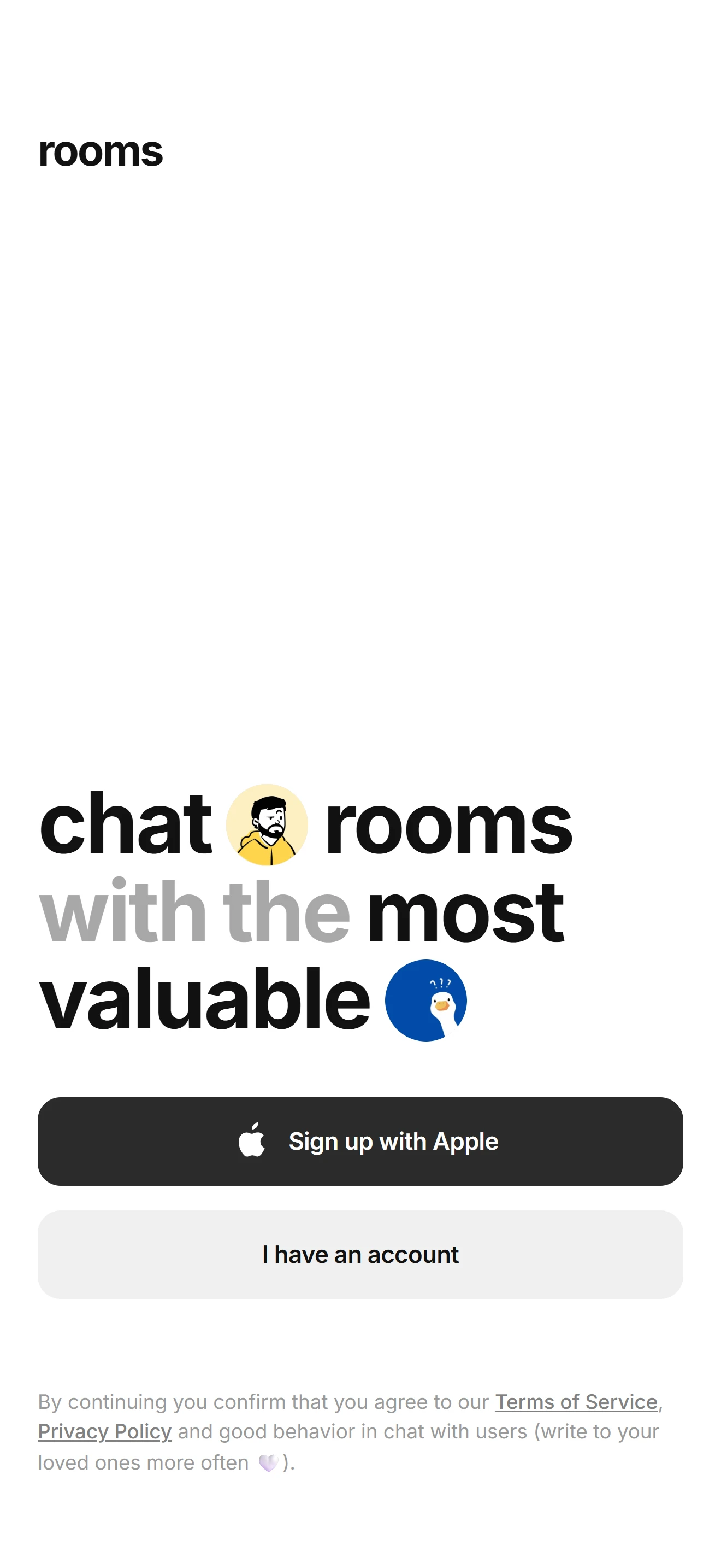

Приветствие
Приветствие V4
Первый запуск и онбординг — стартовый кадр приложения.
Установка
src/shared/components/blocks/welcome-v4npx astra-rn add welcome-v4pnpm dlx astra-rn add welcome-v4yarn dlx astra-rn add welcome-v4bunx --bun astra-rn add welcome-v4Зависимости
4 пакетаnpm install @expo-google-fonts/inter expo-asset react-native-safe-area-context react-native-svgpnpm add @expo-google-fonts/inter expo-asset react-native-safe-area-context react-native-svgyarn add @expo-google-fonts/inter expo-asset react-native-safe-area-context react-native-svgbun add @expo-google-fonts/inter expo-asset react-native-safe-area-context react-native-svgИсходник
4 файлаimport {
Inter_400Regular,
Inter_500Medium,
Inter_600SemiBold,
Inter_700Bold,
useFonts,
} from "@expo-google-fonts/inter";
import React, { memo, useCallback, useState } from "react";
import { Image, Pressable, StyleSheet, Text, View } from "react-native";
import { useSafeAreaInsets } from "react-native-safe-area-context";
import Svg, { Path } from "react-native-svg";
import {
ACTION_GAP,
ACTION_HEIGHT,
ACTION_RADIUS,
AVATAR_SIZE,
COLORS,
CONTENT_HORIZONTAL_PADDING,
DEFAULT_ACTIONS,
DEFAULT_HEADLINE,
DEFAULT_LEGAL_LINKS,
DEFAULT_LEGAL_PREFIX,
DEFAULT_LEGAL_SUFFIX,
DEFAULT_WORDMARK,
FONTS,
HEADLINE_LINE_HEIGHT,
HEADLINE_SIZE,
ICON_SIZE,
WORDMARK_SIZE,
} from "./const";
import type {
IGlyph,
IWelcomeAction,
IWelcomeActionRow,
IWelcomeScreenV4,
IWelcomeToken,
} from "./types";
const AppleGlyph: React.FC<IGlyph> = ({
size = ICON_SIZE,
color = COLORS.primaryLabel,
}: IGlyph) => (
<Svg width={size * 1.9} height={size * 1.922} viewBox="0 0 24 24" fill="none">
<Path
d="M17.02 12.54c.02 2.19 1.92 2.92 1.94 2.93-.02.05-.3 1.04-1 2.06-.6.88-1.23 1.76-2.22 1.78-.97.02-1.28-.58-2.39-.58s-1.45.56-2.37.6c-.95.03-1.68-.95-2.28-1.83-1.25-1.8-2.2-5.08-.92-7.3.63-1.1 1.76-1.8 2.99-1.81.93-.02 1.82.63 2.39.63.57 0 1.64-.78 2.77-.67.47.02 1.8.19 2.65 1.44-.07.04-1.58.92-1.56 2.75M15.31 6.02c.5-.61.84-1.46.75-2.31-.73.03-1.61.49-2.13 1.1-.47.54-.88 1.4-.77 2.23.81.06 1.64-.41 2.15-1.02"
fill={color}
/>
</Svg>
);
const ICONS: Record<NonNullable<IWelcomeAction["icon"]>, React.FC<IGlyph>> = {
apple: AppleGlyph,
};
const Headline: React.FC<{ tokens: IWelcomeToken[] }> = memo(({ tokens }) => (
<View style={styles.headline}>
{tokens.map((token, index) =>
token.kind === "word" ? (
<Text
key={`${token.text}-${index}`}
style={[styles.word, token.muted ? styles.wordMuted : null]}
>
{token.text}
</Text>
) : (
<View
key={`avatar-${index}`}
style={[styles.avatar, { backgroundColor: token.background }]}
>
{token.source ? (
<Image
source={{ uri: token.source }}
style={styles.avatarImage}
resizeMode="cover"
/>
) : (
<Text style={styles.avatarEmoji}>{token.emoji}</Text>
)}
</View>
),
)}
</View>
));
const ActionRow: React.FC<IWelcomeActionRow> = memo(
({ action, onPress }: IWelcomeActionRow) => {
const [pressed, setPressed] = useState<boolean>(false);
const primary = action.variant !== "secondary";
const Icon = action.icon ? ICONS[action.icon] : null;
const handlePress = useCallback(() => onPress?.(action), [action, onPress]);
const handlePressIn = useCallback(() => setPressed(true), []);
const handlePressOut = useCallback(() => setPressed(false), []);
return (
<Pressable
accessibilityRole="button"
accessibilityLabel={action.label}
onPress={handlePress}
onPressIn={handlePressIn}
onPressOut={handlePressOut}
style={[
styles.action,
primary ? styles.actionPrimary : styles.actionSecondary,
pressed
? primary
? styles.actionPrimaryPressed
: styles.actionSecondaryPressed
: null,
]}
>
{Icon ? <Icon size={ICON_SIZE} /> : null}
<Text
style={[
styles.actionLabel,
primary ? styles.actionLabelPrimary : styles.actionLabelSecondary,
]}
numberOfLines={1}
>
{action.label}
</Text>
</Pressable>
);
},
);
const WelcomeScreenV4: React.FC<IWelcomeScreenV4> = ({
wordmark = DEFAULT_WORDMARK,
headline = DEFAULT_HEADLINE,
actions = DEFAULT_ACTIONS,
legalPrefix = DEFAULT_LEGAL_PREFIX,
legalLinks = DEFAULT_LEGAL_LINKS,
legalSuffix = DEFAULT_LEGAL_SUFFIX,
logo,
style,
onActionPress,
}: IWelcomeScreenV4) => {
const insets = useSafeAreaInsets();
const [loaded] = useFonts({
Inter_400Regular,
Inter_500Medium,
Inter_600SemiBold,
Inter_700Bold,
});
if (!loaded) {
return <View style={[styles.container, style]} />;
}
return (
<View style={[styles.container, style]}>
<View style={[styles.header, { paddingTop: insets.top + 12 }]}>
{logo ?? <Text style={styles.wordmark}>{wordmark}</Text>}
</View>
<View style={[styles.content, { paddingBottom: insets.bottom + 20 }]}>
<Headline tokens={headline} />
<View
style={[
styles.actions,
{
paddingBottom: insets.bottom,
},
]}
>
{actions.map((action) => (
<ActionRow
key={action.key}
action={action}
onPress={onActionPress}
/>
))}
</View>
<Text style={styles.legal}>
{legalPrefix}{" "}
{legalLinks.map((link, index) => (
<Text key={link.key}>
<Text
accessibilityRole="link"
onPress={link.onPress}
style={styles.legalLink}
>
{link.label}
</Text>
{index < legalLinks.length - 1 ? ", " : " "}
</Text>
))}
{legalSuffix}
</Text>
</View>
</View>
);
};
const styles = StyleSheet.create({
container: {
flex: 1,
backgroundColor: COLORS.screen,
},
header: {
paddingHorizontal: CONTENT_HORIZONTAL_PADDING,
},
wordmark: {
fontFamily: FONTS.bold,
fontSize: WORDMARK_SIZE,
lineHeight: WORDMARK_SIZE * 1.3,
letterSpacing: -1,
color: COLORS.wordmark,
},
content: {
flex: 1,
justifyContent: "flex-end",
paddingHorizontal: CONTENT_HORIZONTAL_PADDING,
},
headline: {
flexDirection: "row",
flexWrap: "wrap",
alignItems: "center",
columnGap: 9,
rowGap: 2,
marginBottom: 34,
},
word: {
fontFamily: FONTS.bold,
fontSize: HEADLINE_SIZE,
lineHeight: HEADLINE_LINE_HEIGHT,
letterSpacing: -1.4,
color: COLORS.headline,
},
wordMuted: {
color: COLORS.headlineMuted,
},
avatar: {
width: AVATAR_SIZE,
height: AVATAR_SIZE,
marginTop: 2,
borderRadius: AVATAR_SIZE / 2,
alignItems: "center",
justifyContent: "center",
overflow: "hidden",
},
avatarImage: {
width: "100%",
height: "100%",
},
avatarEmoji: {
fontSize: AVATAR_SIZE * 0.55,
lineHeight: AVATAR_SIZE * 0.72,
},
actions: {
gap: ACTION_GAP,
},
action: {
flexDirection: "row",
alignItems: "center",
justifyContent: "center",
gap: 8,
height: ACTION_HEIGHT,
paddingHorizontal: 18,
borderRadius: ACTION_RADIUS,
},
actionPrimary: {
backgroundColor: COLORS.primary,
},
actionPrimaryPressed: {
backgroundColor: COLORS.primaryPressed,
},
actionSecondary: {
backgroundColor: COLORS.secondary,
},
actionSecondaryPressed: {
backgroundColor: COLORS.secondaryPressed,
},
actionLabel: {
fontFamily: FONTS.semiBold,
fontSize: 15.5,
letterSpacing: -0.2,
},
actionLabelPrimary: {
color: COLORS.primaryLabel,
},
actionLabelSecondary: {
color: COLORS.secondaryLabel,
},
legal: {
fontFamily: FONTS.regular,
marginTop: 20,
fontSize: 13,
lineHeight: 20,
color: COLORS.legal,
},
legalLink: {
fontFamily: FONTS.medium,
color: COLORS.legalLink,
textDecorationLine: "underline",
},
});
export { WelcomeScreenV4 };
export type {
IGlyph,
IWelcomeAction,
IWelcomeActionRow,
IWelcomeLegalLink,
IWelcomeScreenV4,
IWelcomeToken,
} from "./types";
export default memo(WelcomeScreenV4);import type { IWelcomeAction, IWelcomeLegalLink, IWelcomeToken } from "./types";
import { PHOTO_SOURCES } from "./photos";
export const DEFAULT_WORDMARK = "rooms";
export const DEFAULT_HEADLINE: IWelcomeToken[] = [
{ kind: "word", text: "chat" },
{
kind: "avatar",
background: "#dcd8f7",
source:
PHOTO_SOURCES["welcome-v4-1"],
},
{ kind: "word", text: "rooms" },
{ kind: "word", text: "with", muted: true },
{ kind: "word", text: "the", muted: true },
{ kind: "word", text: "most" },
{ kind: "word", text: "valuable" },
{
kind: "avatar",
background: "#cfe6d2",
source:
PHOTO_SOURCES["welcome-v4-2"],
},
];
export const DEFAULT_ACTIONS: IWelcomeAction[] = [
{
key: "apple",
label: "Sign up with Apple",
icon: "apple",
variant: "primary",
},
{
key: "login",
label: "I have an account",
variant: "secondary",
},
];
export const DEFAULT_LEGAL_PREFIX =
"By continuing you confirm that you agree to our";
export const DEFAULT_LEGAL_LINKS: IWelcomeLegalLink[] = [
{ key: "terms", label: "Terms of Service" },
{ key: "privacy", label: "Privacy Policy" },
];
export const DEFAULT_LEGAL_SUFFIX =
"and good behavior in chat with users (write to your loved ones more often 🤍).";
export const FONTS = {
bold: "Inter_700Bold",
semiBold: "Inter_600SemiBold",
medium: "Inter_500Medium",
regular: "Inter_400Regular",
} as const;
export const HEADLINE_SIZE = 55;
export const HEADLINE_LINE_HEIGHT = 54;
export const AVATAR_SIZE = 50;
export const ICON_SIZE = 17;
export const CONTENT_HORIZONTAL_PADDING = 23;
export const ACTION_HEIGHT = 54;
export const ACTION_RADIUS = 14;
export const ACTION_GAP = 15;
export const WORDMARK_SIZE = 28;
export const COLORS = {
screen: "#ffffff",
wordmark: "#111111",
headline: "#111111",
headlineMuted: "#a8a8a8",
primary: "#2b2b2b",
primaryPressed: "#454545",
primaryLabel: "#ffffff",
secondary: "#f0f0f0",
secondaryPressed: "#e4e4e4",
secondaryLabel: "#111111",
legal: "#9a9a9a",
legalLink: "#818181",
} as const;import type { StyleProp, ViewStyle } from "react-native";
export interface IGlyph {
size?: number;
color?: string;
}
export type WelcomeActionVariant = "primary" | "secondary";
export interface IWelcomeAction {
key: string;
label: string;
icon?: "apple";
variant?: WelcomeActionVariant;
}
export interface IWelcomeActionRow {
action: IWelcomeAction;
onPress?: (action: IWelcomeAction) => void;
}
export type IWelcomeToken =
| { kind: "word"; text: string; muted?: boolean }
| { kind: "avatar"; background: string; emoji?: string; source?: string };
export interface IWelcomeLegalLink {
key: string;
label: string;
onPress?: () => void;
}
export interface IWelcomeScreenV4 {
wordmark?: string;
headline?: IWelcomeToken[];
actions?: IWelcomeAction[];
legalPrefix?: string;
legalLinks?: IWelcomeLegalLink[];
legalSuffix?: string;
logo?: React.ReactNode;
style?: StyleProp<ViewStyle>;
onActionPress?: (action: IWelcomeAction) => void;
}import { Asset } from "expo-asset";
const uri = (id: number): string => Asset.fromModule(id).uri;
export const PHOTO_SOURCES = {
"welcome-v4-1": uri(require("./welcome-v4-1.webp")),
"welcome-v4-2": uri(require("./welcome-v4-2.webp")),
};
